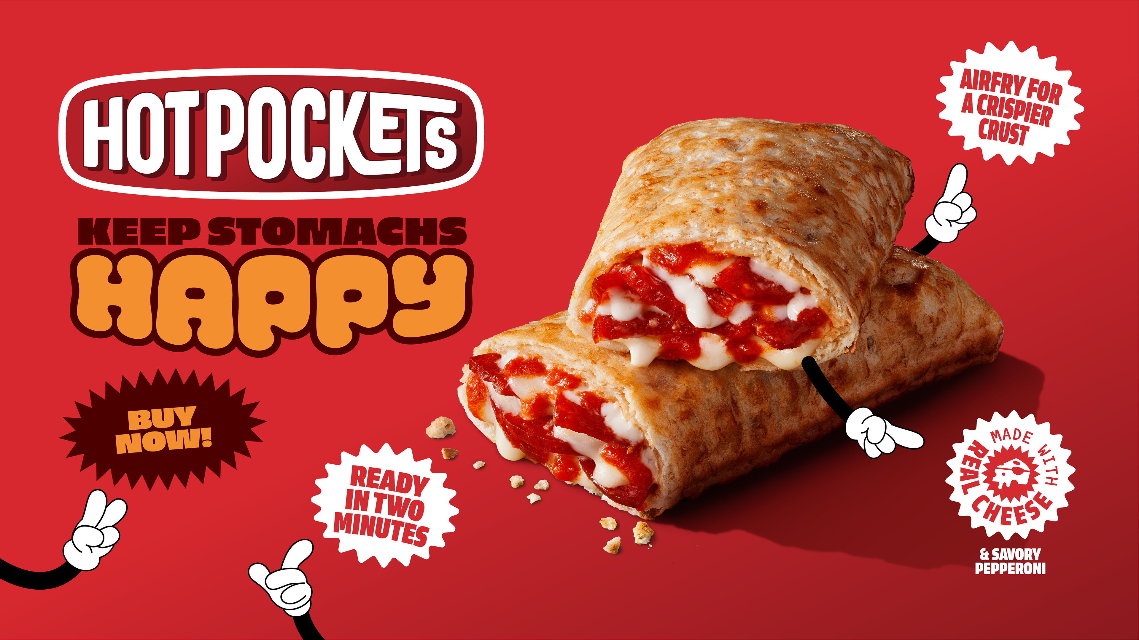


Campaign Design for Hot Pockets USA
This visual was part of a campaign concept developed for Hot Pockets USA. I created and presented two creative routes—this fun, bold version was selected by the client. The design emphasizes approachability and energy, using playful type, bright colors, and illustrated arms to bring the product to life. The messaging is simple and effective, highlighting key benefits like speed, flavor, and convenience. The tone is lighthearted and visually loud, staying true to the youthful, snackable spirit of the brand.